The following exhibition will provide an overview of the propaganda posters made by artist Toivo Kulles and place them in a broader socio-political context, exploring how the Soviets used art to convey its ideological messages. The posters on display belong to a private collection and have never been publicly exhibited before. The aim of the exhibition is to uncover the nature of propaganda posters, their impact, and the role of the artist within the Soviet system.
The curator of this exhibit is Aare Alver.
Toivo Kulles (1918-1984)
Toivo Kulles was an Estonian graphic artist and book illustrator whose work primarily focused on drypoint and lithography techniques. He designed books, created posters and applied graphics, and memorialised both Tallinn Old Town as well as his mining landscapes from his childhood in his works.
Toivo Kulles was born on January 3rd, 1918, in the Estonian town of Jõhvi, as the sixth child in his family. They lived in the village of Sompa in the Ida-Virumaa region, the main mining area in Estonia, and his parents were agricultural workers. In 1937, he graduated from Jõhvi progymnasium and then enrolled in the National Applied Art School, where he studied until 1941. Due to the outbreak of the Second World War, he did not complete his degree at the time but resumed his art studies after the war in 1945. Afterwards, he studied painting at the National Applied Art Institute in Tallinn, graduating in 1948. From 1949 onwards, Toivo Kulles was a member of the Artists’ Union. Kulles did not consider fame as a working aim; he was a modest man and dedicated himself to his art quietly and persistently. He was married to a fashion and textiles artist Hilja Kulles and his legacy lives on in Estonian museums, which hold nearly a hundred of his creations in their collections.
Propaganda and Propaganda Posters
Propaganda is the deliberate dissemination and explanation of ideas, convictions, doctrines, or knowledge. Propaganda is also considered a form of advertising that mainly serves psychological and ideological interests. Propaganda was one of the main tools used to shape and influence public sentiment, attitudes, and behaviour in the Soviet Union.
In that respect, the Soviet Union did not differ greatly from other authoritarian regimes. In fact, many parallels can be drawn with its greatest opponent, Nazi Germany – especially during the Stalin era. Posters were the most direct and straightforward form of art subjected to party control, as they conveniently combine both text and visual messaging.
Which kinds of posters to make and how to make them were determined by the Soviet authorities: direct guidelines came from Moscow, and local censors ensured they were followed. Nevertheless, despite hefty compensation, artists were generally reluctant to accept poster commissions and preferred to take on less lucrative work if they had the opportunity. Yet their options were limited – an accusation of “creative passivity” could lead to expulsion from the Artists’ Union, which would end their ability to make a living as an artist.
But even artists who due to their institutional position were forced to accept poster commissions, often procrastinated in completing them. Unfortunately, they had no creative freedom, as all poster themes were pre-assigned, which in turn likely dampened their enthusiasm in creating them. Undoubtedly, another significant factor was that many artists’ worldviews did not align with those of the Soviet Union.
Toivo Kulles’ propaganda posters
Toivo Kulles’ propaganda posters reflect the ideological aims and directives of the Soviet Union. His works feature several recurring themes that highlight both a socialist society and an international political message. Central themes in many of Kulles’ posters include for example peace and international friendship.
1. “Our path is the path of peace”
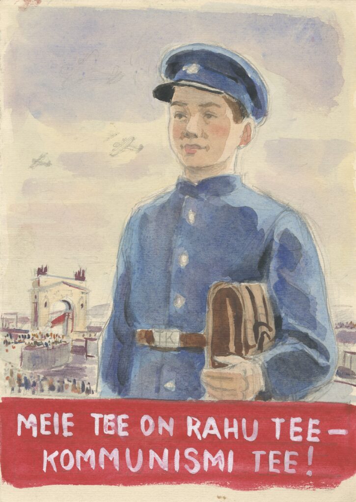
In this watercolour-style poster, a schoolboy in uniform is depicted looking hopefully towards the future and is meant to symbolise the importance of peace. The poster emphasises that peace is achievable (only?) through communism. In the background, a peaceful demonstration can be seen, with a red flag waving and a triumphal arch depicted, which carries a symbolic meaning but most likely never actually existed. The inscription “Our path is the path of peace – the path of communism!” emphasises the core values of communist ideology – peace and collectivism. The poster dates from the 1950s-1960s and its purpose was to foster loyal youth and strengthen communist identity from an early age.
2. “Let’s create new fruit and berry orchards in the kolkhozes!”
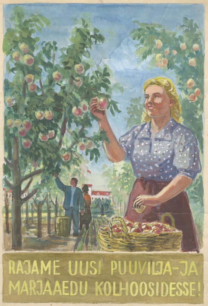
This watercolour-style poster depicts the agricultural development of Soviet kolkhozes – collective farms – and the importance of collective labour. A happy-looking woman symbolises social harmony, calling for the establishment of new fruit and berry orchards, which would help feed the war-ravaged Soviet people. The famous plant breeder Ivan Michurin, who became well known already at the beginning of the Soviet era, called on all Soviet peoples to plant new apple orchards, and there was also a kolkhoz named after him in Estonia.
3. “Let’s greet the youth of the whole world fighting for peace!”
The poster is centred on a battle ready young woman who calls on the youth of the world to fight for peace. The background, featuring the Kremlin tower and red flags, adds a sense of power to the poster. This poster was likely created between 1950 and 1960.
4. “Book lovers! Order literature by mail!”
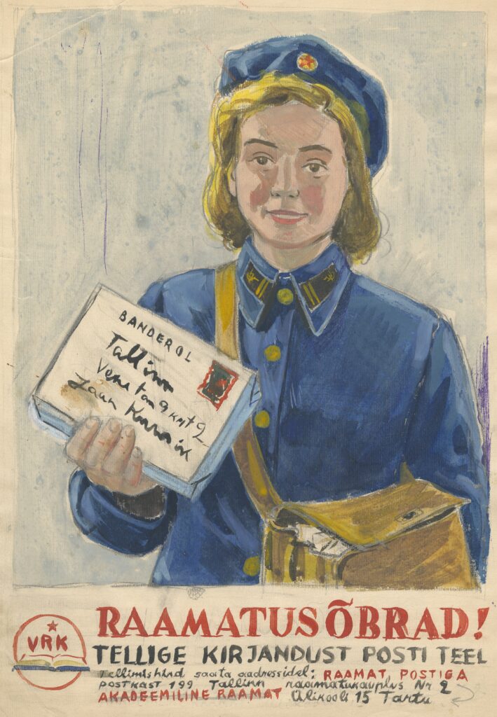
The postal worker on the poster symbolises the hardworking Soviet woman, calling on people to order books by mail. The abbreviation “VRK” visible on the poster stood for the Republican Book Trade Office. It was a state organisation responsible for the distribution and sale of books in the Estonian Soviet Socialist Republic (ESSR). VRK focused on the distribution of propaganda literature according to a set plan. Soviet symbolism is also reflected in the red star on her hat and the hammer and sickle on her collar.
5. Pair of posters: “Ready to work and to defend the USSR!”
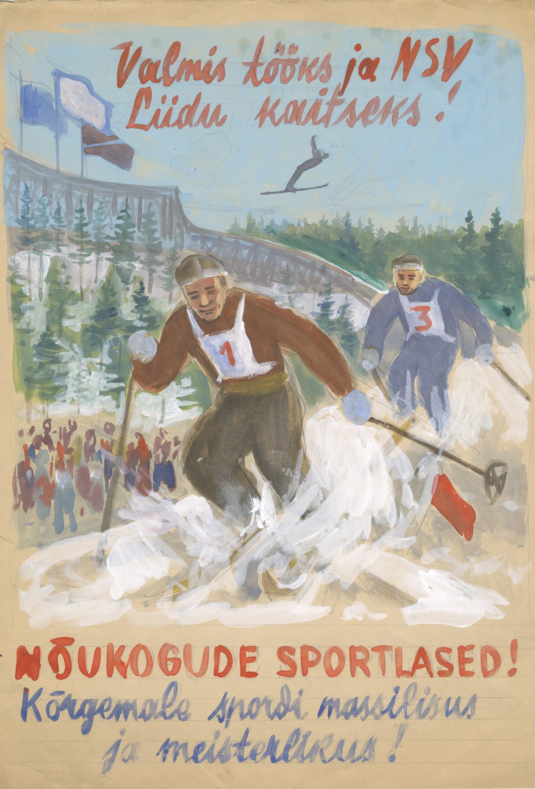
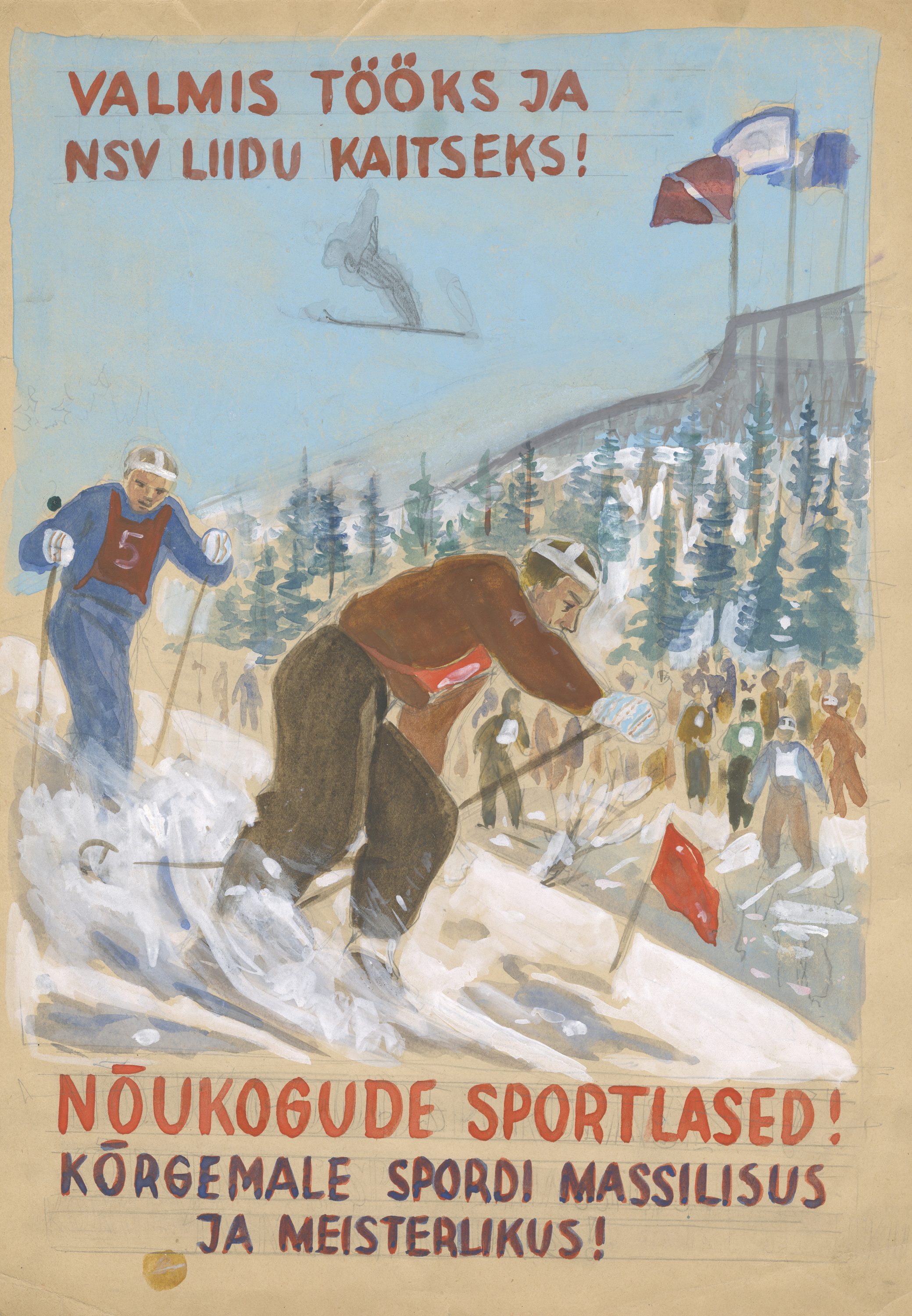
These posters depict Soviet athletes who are propagating the importance and significance of sports. The fact that they are Soviet athletes is specifically emphasised by the red flags on the ski slope. According to the drafts, this poster was printed in 1950.
The posters reflect the political, social, and cultural context of the mid-20th century, just like other poster designs. Politically, they were influenced by the Cold War, during which sports was used as a means of ideological struggle and to demonstrate the superiority of communism. The slogan “READY TO WORK AND TO DEFEND THE USSR!” shows that in the late 1940s and 1950s, athletes had additional roles beyond training, competing, and achieving good results in the ESSR. Athletes were involved in public life, viewed as role models embodying qualities suitable for the Soviet person, and contributing to the maintenance of the existing order.
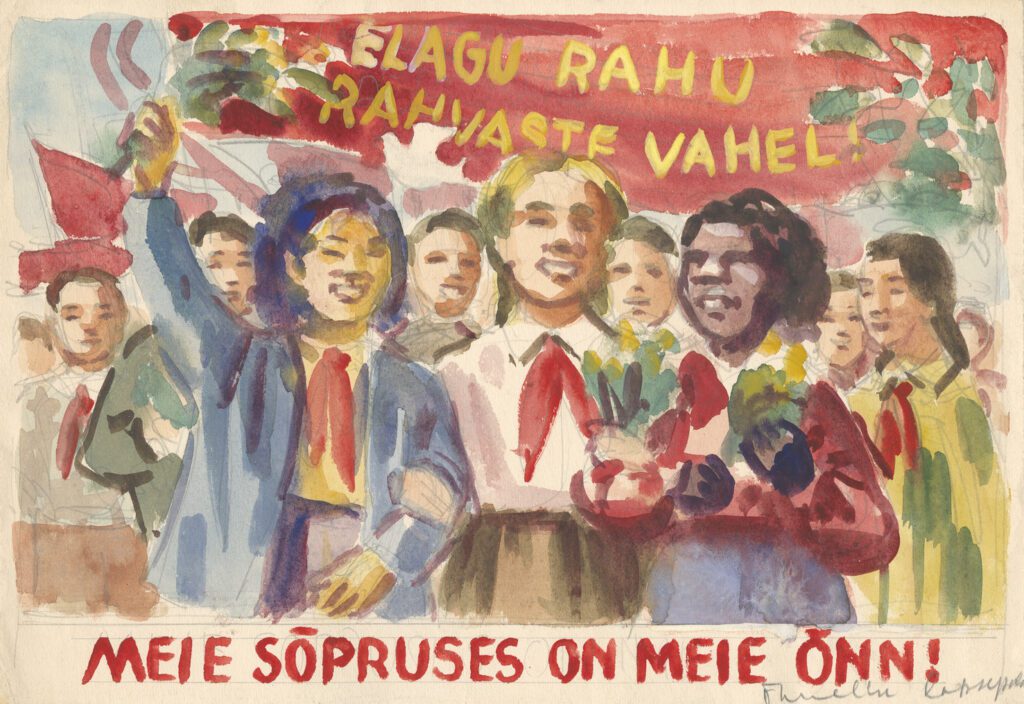
6. Pair of posters: “We will not allow war!”
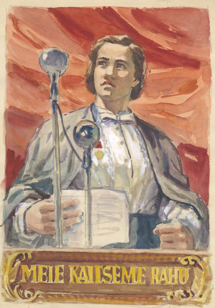
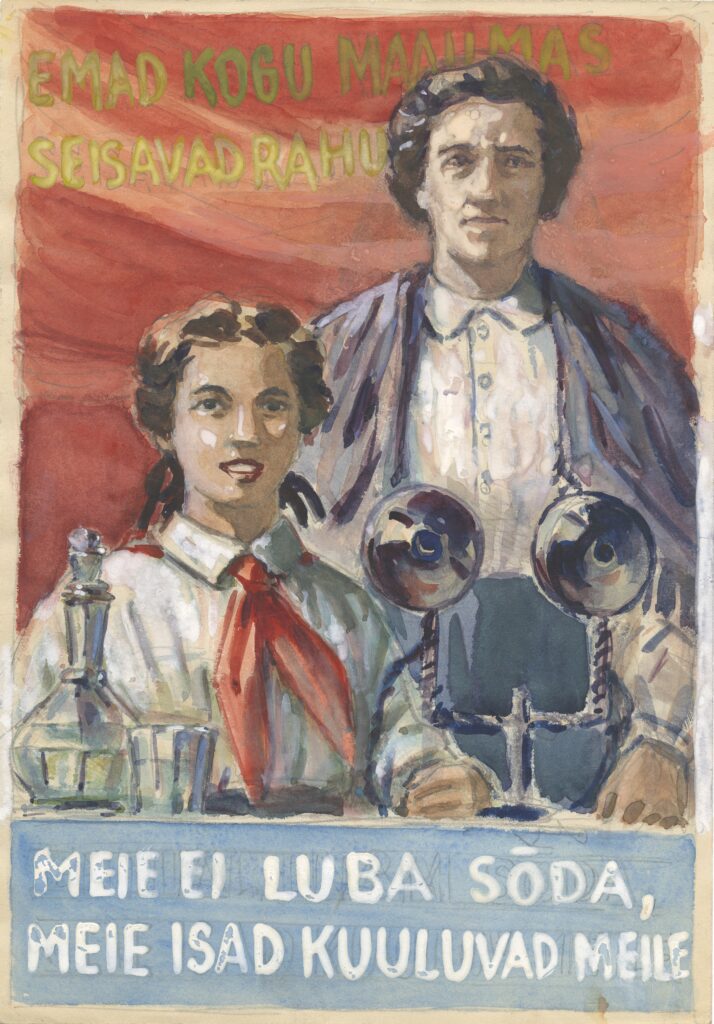
These posters call on the Soviet people to fight for peace. The right-hand poster also symbolises the importance of family and unity. The red scarf around the girl’s neck indicates that she, as a model Soviet youth, belongs to the Pioneer organisation; the scarf along with the red flags waving in the background, were very common Soviet symbols at the time.
In Soviet Union, women played an integral part in the society, and posters often featured young women and mothers in the foreground. The writing on the posters “MOTHERS ALL OVER THE WORLD STAND FOR PEACE” and “WE WILL NOT ALLOW WAR, OUR FATHERS BELONG TO US” are emotional, yet they carry a strong political message: peace must be upheld, defended, and fought for.
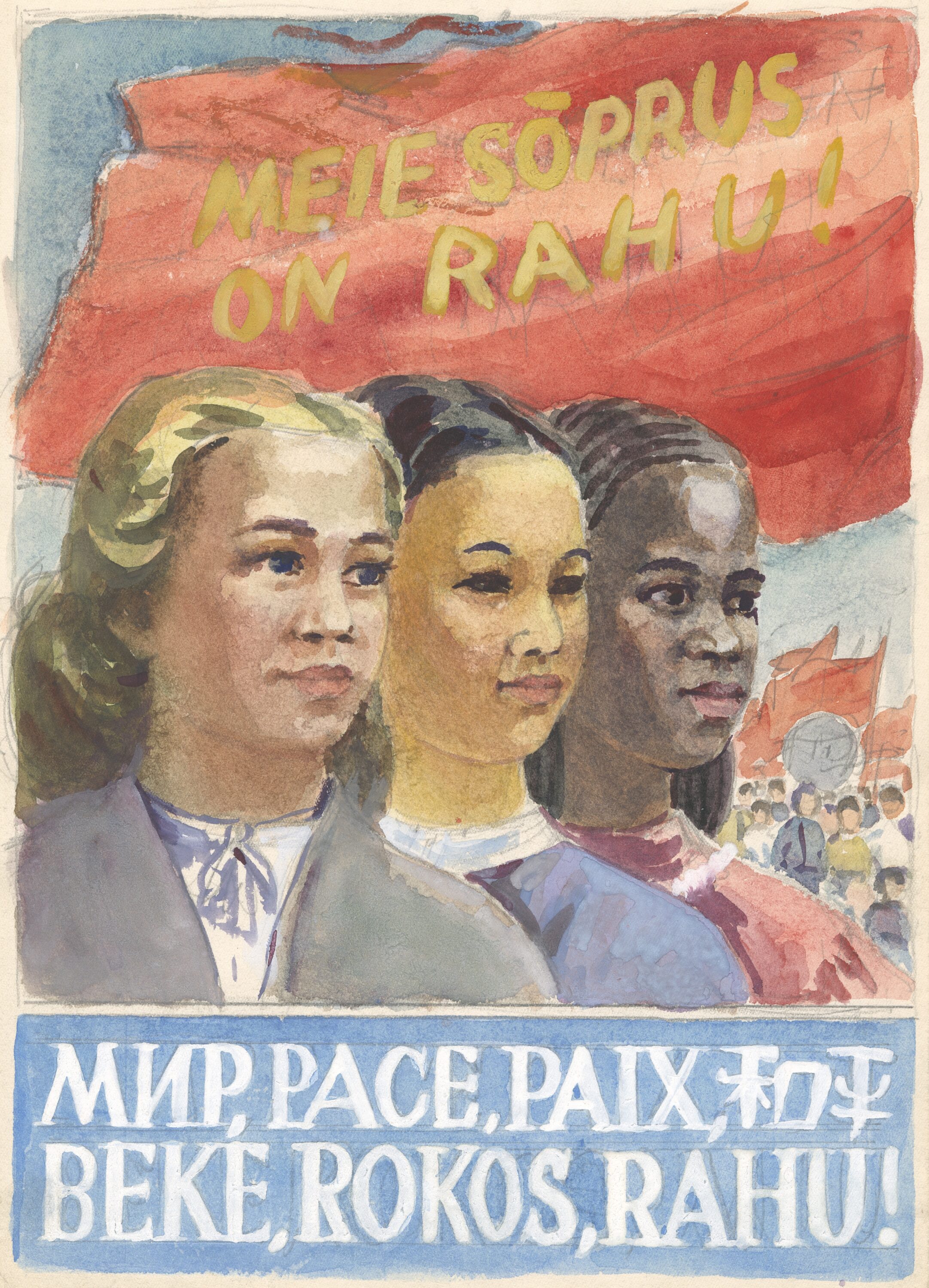
7. Pair of posters: “Our friendship is peace!”
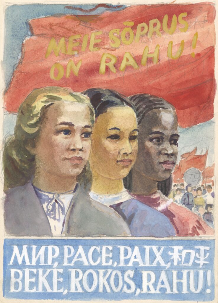
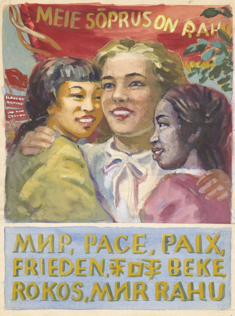
These posters from the early 1950s, have the word “PEACE” written not only in Estonian but also in several other languages (Russian, Italian, French, Chinese, Hungarian, German, etc.). This is meant to emphasise the friendship of nations, solidarity, and the shared fight for peace. The different skin tones of the girls further highlight the unity of peoples and their readiness to fight together. The red flags waving in the background symbolise the importance and unity of the Soviet Union. The poster drafts carry a strong ideological message about the importance of peace, friendship amongst nations, and global solidarity.
8. Trio of posters: “Friendship of Nations!”
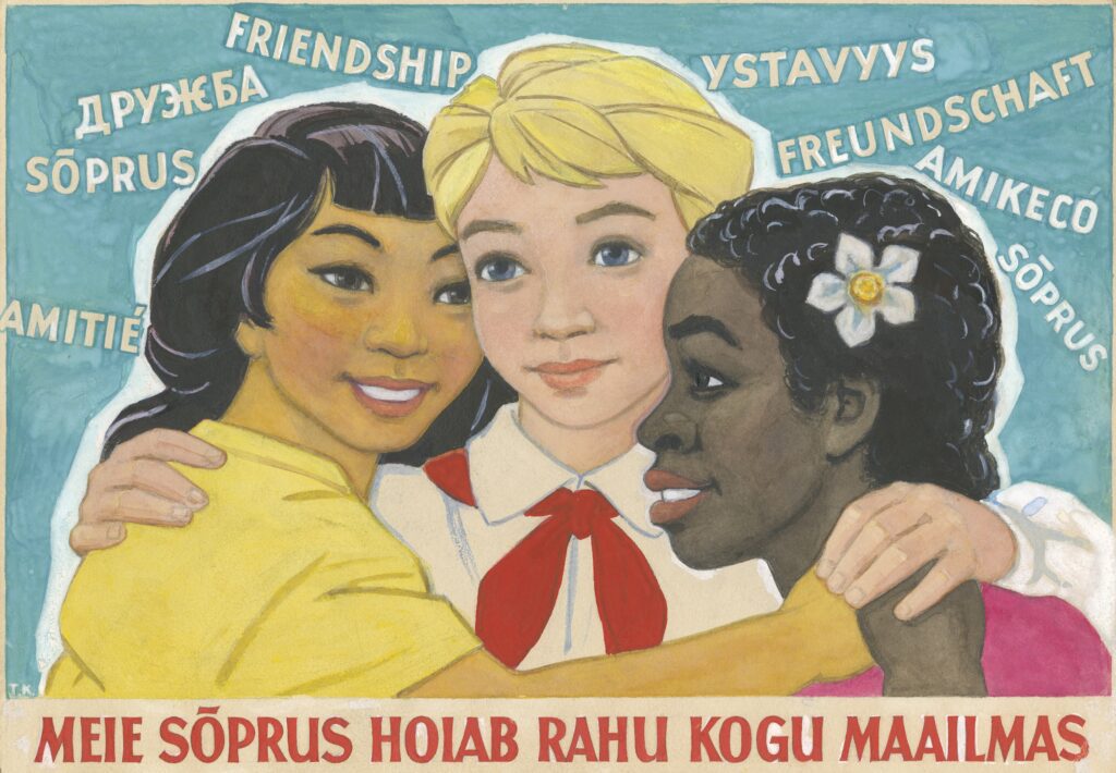
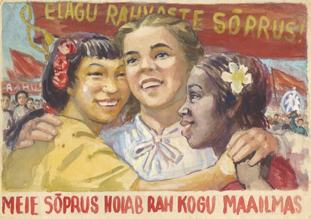
These posters depict Soviet era peace propaganda and date from approximately the 1950s–1960s. The three posters show the friendship of children from different races, emphasising the importance of peace and international unity. Such posters were part of a broader propaganda effort carried out in many parts of the world, but especially in the Soviet Union.
Sample Lesson Plan
Below is one possible way to conduct a 45-minute class analysing propaganda posters based on Toivo Kulles’ poster drafts:
| Part of the lesson | Description | Duration |
| Introduction and contextualisation | A brief overview of Toivo Kulles’ life and his role in Soviet-era propaganda art. The nature and purpose of propaganda posters- help students understand the context in which they were created | 5 min |
| Group work – analysing posters | The class can be divided into four groups and each will be given a set of prints of the posters to analyze according to the NoVa propaganda posters study bite. The 5 steps of analyses can also be shown on the big screen. Students can discuss the layout, the messages and the impact of the posters in their groups. | 15 min |
| Group presentation | Each group presents their posters. | 10 min |
| Introduction and comparison | Introduction of the exhibition and explanations of each poster. Students compare their own observations with the author’s analysis, gaining a deeper understanding of a scholarly approach. | 10 min |